FREDRIKA BREMER-FÖRBUNDET WEBSITE 2.0
The Frederika Bremer-Förbundet (FBF) website redesign highlights the potential of human-centred design to boost engagement for an organisation working towards gender equity and those who want to support them. By creating a human-centred digital experience, the redesign aimed to improve the website's usability, clarify information for different audiences, and inspire users to take action.
Website history


FBF has been doing their best to promote women’s rights and gender equity through education, member activities and scholarships. But they don't stop there - they're constantly expanding their impact by providing information and events.
Design for who?
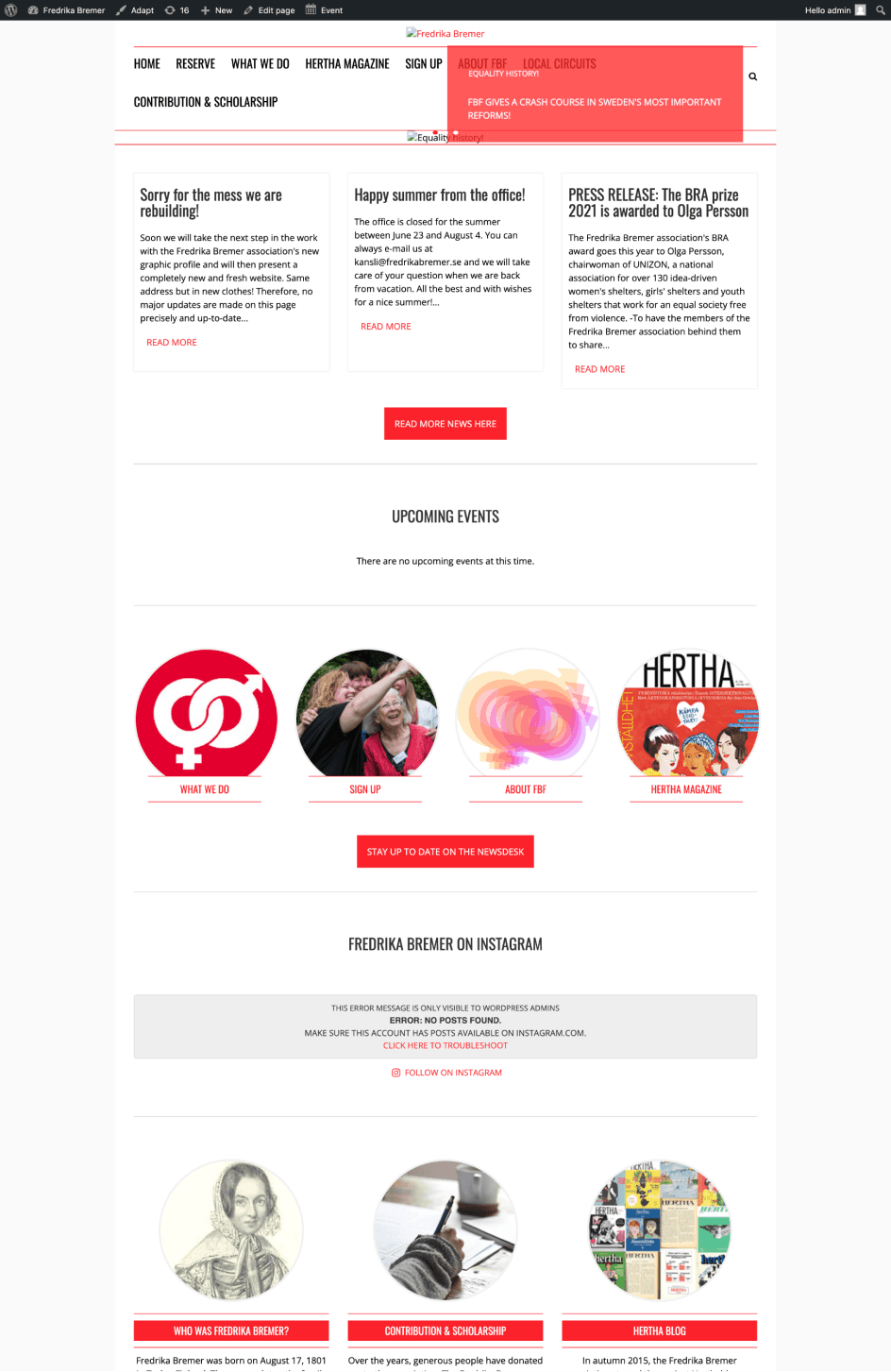
Their website - even though re-designed on 2021, struggled to effectively communicating FBF's missions. Fundamental usability was challenged. As they added more information and new features, the design of website optimised for how ease to maintain than human-centred design principles. In other words, the website wasn't really designed with the needs and expectations of FBF's audience in mind.
DOES IT MATTER?
Today, a website is often the first door of interaction between an organisation and its audience. In an article titled "Designing for Social Impact" from IDEO, authors emphasise the importance of human-centred design in creating effective solutions for social problem.
“BY PUTTING PEOPLE AT THE CENTER OF THE DESIGN PROCESS, WE CAN CREATE SOLUTIONS THAT RESONATE WITH COMMUNITIES AND HAVE A LASTING IMPACT.”
For a non-profit like FBF, a human-centred website is essential for engaging users, building trust, and promoting their mission. A study from Nielsen Norman Group, claims that website visitors often leave web pages in 10-20 seconds, however pages with a clear value and audience can hold people's attention for much longer. Furthermore, when it comes to donation pages. A case study by Danica Ralston found that that good UX alone (not just bombarding people with various types of marketing) can influence consumer behaviour and increase online conversions.
First thing first


So what goals did we have?
The goal of this project, a collaboration between HyperIsland and FBF, was to redesign FBF's website with a focus on three key objectives:
Make it easy for all users to navigate the website, regardless of their familiarity with FBF of its mission.
Increase the visibility and accessibility of the ‘Hire Us’ page to encourage potential partners to engage with FBF’s expertise.
Create a website for effective communication and engagement, inspiring visitors to take action.
To achieve these goals, we were tasked with redesigning the website using FBF's branding assets.
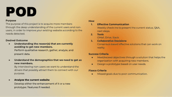
KICK-OFF!
Before we got into the redesign, I wanted to see what works and what is frustrating in the current website. I kicked off with following:
Analysing website analytics using Google Analytics & Semrush.
Reviewing prior researches made by client.
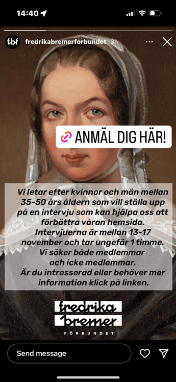
Analysing survey results: We did quick survey with current members of FBF and visitors of website to identify user jobs and usability issues.
Interviews & usability testing: We did in-depth interviews with users, non-users and stakeholders, along with usability testing on current website. The goal was to understand why people use the website, how they interact with the website and what is the usability issues in the website.
Competitive analysis & inspiration: I took a look at our client’s word, brother and sister organisation’s website to see what can be better and interesting examples. We found some interesting similarity.
Workflow


Early insights
Hidden informations.
Users were frustrated with finding informations about organisation. Users wanted to reach right information in right place.
Trust issues.
Often, users were not convinced enough to take an action. Users would need to know transparency information.
Unexpected designs.
Users were annoyed that confusing navigation, and calls-to-action on the website caused them to miss important information.
DISCOVERY
During my research, I was surprised by the insights we found. It felt like they are too obvious. However, after asking ‘why’ again and again, it became clear that users have expectations for a seamless and effortless experience. As FBF has many offers on the website, users require clear guidance to accomplish their jobs efficiently.
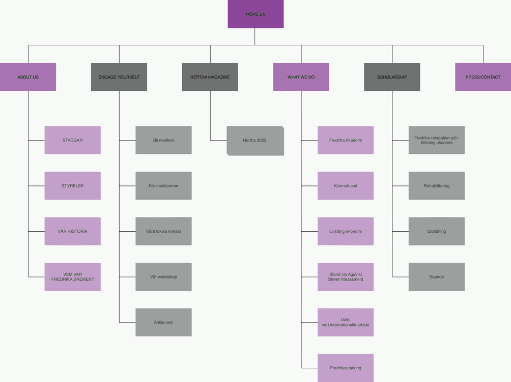
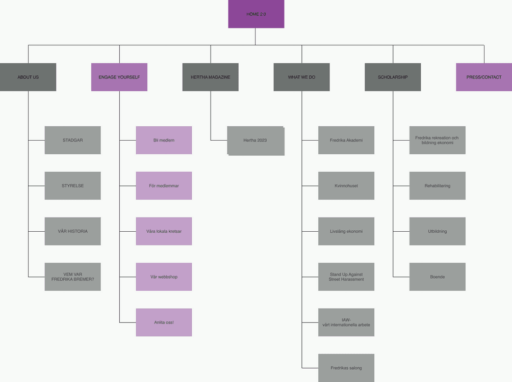
This discovery led me to make user personas and card sorting. Based on research and data, I made 3 illustrated personas to represent our key user needs, goals and state of mind. These personas were guideline for us to stay focusing on user’s needs. We also did card sorting exercise to rethink information architecture. Using answers of user interview and survey, we reorganised website’s content, topic and information by user’s expectations. We also included users and client to this exercise and got some valuable feedbacks.
Workflow


Deeper insights
Not only information about FBF but also storytelling & inspiration influence the decision to join membership.
Unclear website hierarchy and unstructured information make it challenging to achieve a goal.
OPPORTUNITY
The FBF's website currently causes confusion for users due to poorly designed navigation, an unclear target audience, difficulties in finding certain pages, ambiguous information, and an inefficient layout. These distractions challenge effective communication between the FBF and its users, dropping users interests.
“HOW MIGHT WE HELP USERS AND THE FBF COMMUNICATE BETTER THROUGH THE WEBSITE?”
We had three main audiences we had to design for:
Head of organisation or people from outside the organisation who are looking to hire FBF to provide education sessions for them.
Current member of FBF who are looking to event information and news.
Journalists or people from outside the organisation who are looking to announces and information about FBF.
The website comprised of two different experiences. The informative experience where provides comprehensive information about FBF, its mission, and activities is to educate and encourage user to take action in FBF initiatives. While engaging experience is designed for current members and interested visitors, and facilitates easy to participate but demonstrates organisational transparency clearly. We restructured the site’s information flow to create a narrative journey. This redesign guides users naturally from informative experience to engaging experience.
Different User Journeys
Let’s talk about it!
Throughout the project, we maintained close collaboration with our client, involving them in key decision-making processes. A crucial decision was to create three main templates for different levels of the site, plus a few additional templates. We then organised all pages into these template categories. With this planning, we not only improved efficiency during development but also set the foundation for easier long-term management of the website.

DESIGN
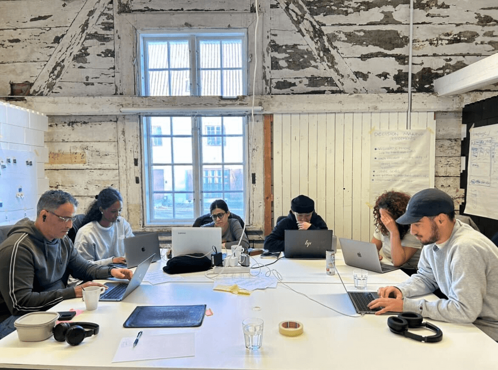
Our user-centric design process prioritised collaboration and continuous improvement. We had regular design feedback sessions and interactive workshops with our clients. We had many rounds of testing & iterations with both previous interview participants and industry experts to put users centre in our design principles. Some testing were held with previous user interview participants and some were held with experts.
Workshop time!


Empathy matters!
“HMMM, IT DOESN’T TELL ME WHY I SHOULD BE INTERESTED ON GENDER EQUALITY. FOR THEM IT IS OBVIOUS… IS GIVEN…, BUT NOT FOR NORMAL PEOPLE LIKE ME. IT IS ALL ABOUT A STORYTELLING!”
- Jorg, User Interview Participant
We wanted to design the website with a keyword ‘empathy’. The above quote is actually from the user interview. Users often said ‘Okay. Now I understand what they are doing… but so what? It didn’t touch my heart.’. User feedback consistently highlighted a critical gap – Users got information but that was it. They felt emotionally disconnected. The first thing we decided to do was building storytelling starting with set the tone to first-person narrative. Then we worked on visualising data & statistic and showcasing real experience from current user. Furthermore, we organised information architecture and menu hierarchy considering our core audiences to make clear user journey.
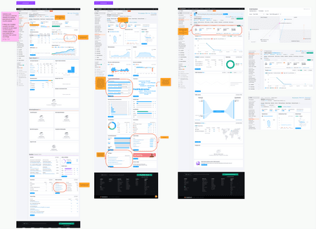
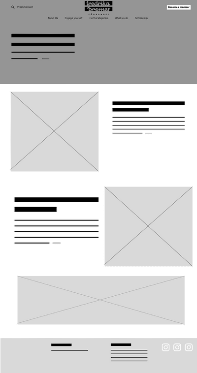
Prototype


Looks
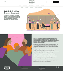
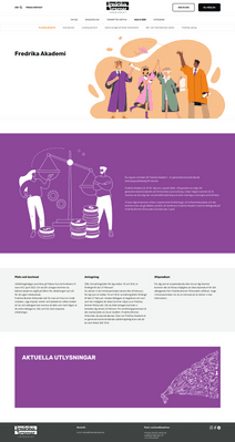
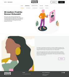
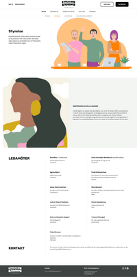
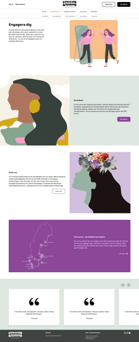
To maintain brand consistency, we used existing assets from FBF's brand book, previously developed by their former design agency. Upon discovering a lack of suitable photographs or illustrations for the website, our team addressed this gap. We created custom illustrations for a visual examples.
Design System


REFLECTION
Designing for social impact requires a deep understanding of the complex challenges organization face and a commitment to putting the needs of users at the heart of the design process. As designers, we have a responsibility to consider the broader impact of our work and use our skills and expertise to create solutions that make a positive difference in the world. The FBF website redesign project shows as a powerful reminder of the role that human-centered design can play in advancing important social causes and driving progress toward a more just and equitable future.
Just like every project, it was such a journey. Among the many things, I want to recap few key takeaways. First, interview matters. It is always great opportunity to hear from users about their expectations, needs and even emotional feelings. User interview was core in our research phase and it helped us to answer our initial hypothesis. Second, don’t overlook classic methods. Often user persona, cart sorting activity are overlooked. Our user personas and information architecture mapping were centre throughout the project, ensuring us focused on addressing our user’s needs and expectations. Third, bringing users and clients into our process. We had several co-creative workshops to understand better and to gather users expectations. It includes ‘sacrificial concepts’, ‘ideations’ and ‘design sprint’. And we had many rounds of quick testing & iteration and feedback sessions while we were designing. This obviously helped us to keep user in centre of our design principle. Lastly, storytelling. I am simply putting what our user said.
“FOR THEM IT IS OBVIOUS… IS GIVEN…, BUT NOT FOR NORMAL PEOPLE LIKE ME. IT IS ALL ABOUT A STORYTELLING!”
